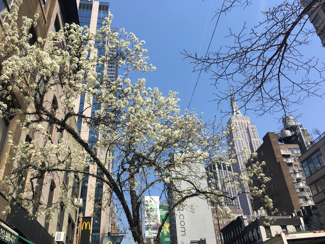
Modern NYC. Or 7 years later
It scream at you, jumps at you, roars loudly, tries to seduce you, throws itself to your knees and swears if dismissed.
New York is nothing like what I remember it. During the first trip to NYC in 2011, back when iPhones were not common, this city has already surprised me with its loudness and business. But since then it has increased both the volume and its speed dramatically. Times Square flashes like a Christmas Tree even in April with commercials of all elite products found under the sun and "all-you-can-take-in" entertainment. People on Times Square keep their heads down, madly rushing somewhere. Only the lights can stop them, and only half the time. Extrapolating this mayhem from Central park to 42rd St, from West End to the Rock(efeller) Center, one can imagine why this city "never sleeps". Even if it went to sleep, it would have lucid dreams filled with even newer commercials of sneakers/watches/perfumes/gate-aways/movies.
The energy here is so saturated, so abruptly startling, so disjoint and suspended, it's almost unsafe to take a deep breath. Everyone here is a stranger to one another, no matter how much they talk out loud (often to themselves).

MoMA - Oasis amidst the noise and haste
It is almost surprising to see anything human and real, when immersed in a whirlpool of sensory stimulation like this. But yet, here comes - Museum of Modern Art, housing the classics of modern European art, fighting for its place under the sun. Alright, that is an exaggeration, since MoMA is like any other building - in the shadow of the neighbouring highrises. It is fighting for life in its fullest expression, in its true form, celebrating beauty and honesty as its highest virtues.
Meeting Vincent where he is at
The original title of the painting, - La nuit étoilée, is charming, mysterious and beautiful, much more dreamy and gentle in its sound than the English analogue.
Vincent wrote to his brother Theo:
"This morning I saw the country from my window a long time before sunrise, with nothing but the morning star, which looked very big." This morning star, or Venus, may be the large white star just left of center in The Starry Night. - MoMA
"Why, I ask myself, shouldn't the shining dots of the sky be as accessible as the black dots on the map of France? Just as we take the train to get to Tarascon or Rouen, we take death to reach a star."
It's vivid and turbulent but balanced in colour and composition, - I believe, this is why it is so magnetic. The subtle interplay of brushstrokes and complimentary colours makes it complete, without giving away or pointing out the details it's made out of. It's a unique meditation for a common man - we look, enjoy, get saturated with calm and the swirly rhythms of the painting, evoking warm golden-yellow emotions dancing on the waves of the night sky.
It is expressive..
The painting, like its daytime companion, The Olive Trees, is rooted in imagination and memory. Leaving behind the Impressionist doctrine of truth to nature in favor of restless feeling and intense color, as in this highly charged picture, van Gogh made his work a touchstone for all subsequent Expressionist painting. - Google Arts & Culture
Vincent is not confusing lucid dreams with reality, he makes a deliberate choice to make the works intense, and vibrant. To resemble his imagination, to reflect his current state of mind.
"I did a landscape with olive trees and also a new study of a starry sky." Later, when the pictures had dried, he sent both of them to Theo in Paris, noting: "The olive trees with the white cloud and the mountains behind, as well as the rise of the moon and the night effect, are exaggerations from the point of view of the general arrangement; the outlines are accentuated as in some old woodcuts." - MoMA
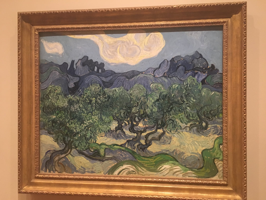
The "Olive Trees" dancing - Saint Rémy, Vincent Van Gogh, 1889
These two painting provide the context required to understand each of them. During the stay in the South of France, Van Gogh painted over 130 pieces in his search for authentic artistic expression. This is a fact. Below are my reflections on this change from Impressionism to Expressionism and the change that checking oneself to asylum would have brought to his life.
We often see artists as privileged. Yet, most of them, if not all, suffer from dismissive critics of their times, from being ahead of the trends, from being broke most of the time, being too loud or too honest. When we think of this painting being sold for $82M at an auction, we think of a privileged life. We don't think of Vincent madly trying to perfect his art, establish it, express himself, struggling to sell any of his artworks, endlessly borrowing of his beloved brother.
And these $82M nowadays.
It almost is a highlight of how cruel the faith of a genius is in our world. He was most probably going crazy, being one of a very few to believe in his own art. And maybe he did not even have to believe in it, he just could not help express it, pursue it, serve it. Often in history, especially when the genius is apparent, we hear of miserable life stories of the artist behind the artwork. What might be the reason? In this specific case, I believe, Vincent was serving his genius. He tried other jobs and had to come back to painting. He was working to exhaustion day and night, day in and day out. It's not an obsession, it is a result of being in possession of something bigger than oneself, - his own talent demanding all of him.
Would he be surprised with his fame if he lived now? What would he think about the numerous selfies taken in front of his artworks to demonstrate the high taste of a gallery visitor, not so much honouring the art(ist) itself? What would he think about being almost pop-culture and mainstream? It's "good taste" to admire Van Gogh, even if we don't know anything about him. Somehow, this thought hurts. He was a real man. He was alive and endured severe struggles, he endured everything for his art - even death. And instead of honouring him for his efforts and genius we made him into an eye-candy which we keep printing on mugs and bracelets... True, at least, we have not forgotten him...
And his close friend at the time, Paul Gauguin, hung just on the other side of the same wall being almost completely ignored with his "Portrait of a Jacob Meyer de Haan". Excuse us Paul, we are modern people, with limited attention span and cropped field of view, - we can only take in 140 characters at a time or one magnificent painting per room (and it's Vincent's).
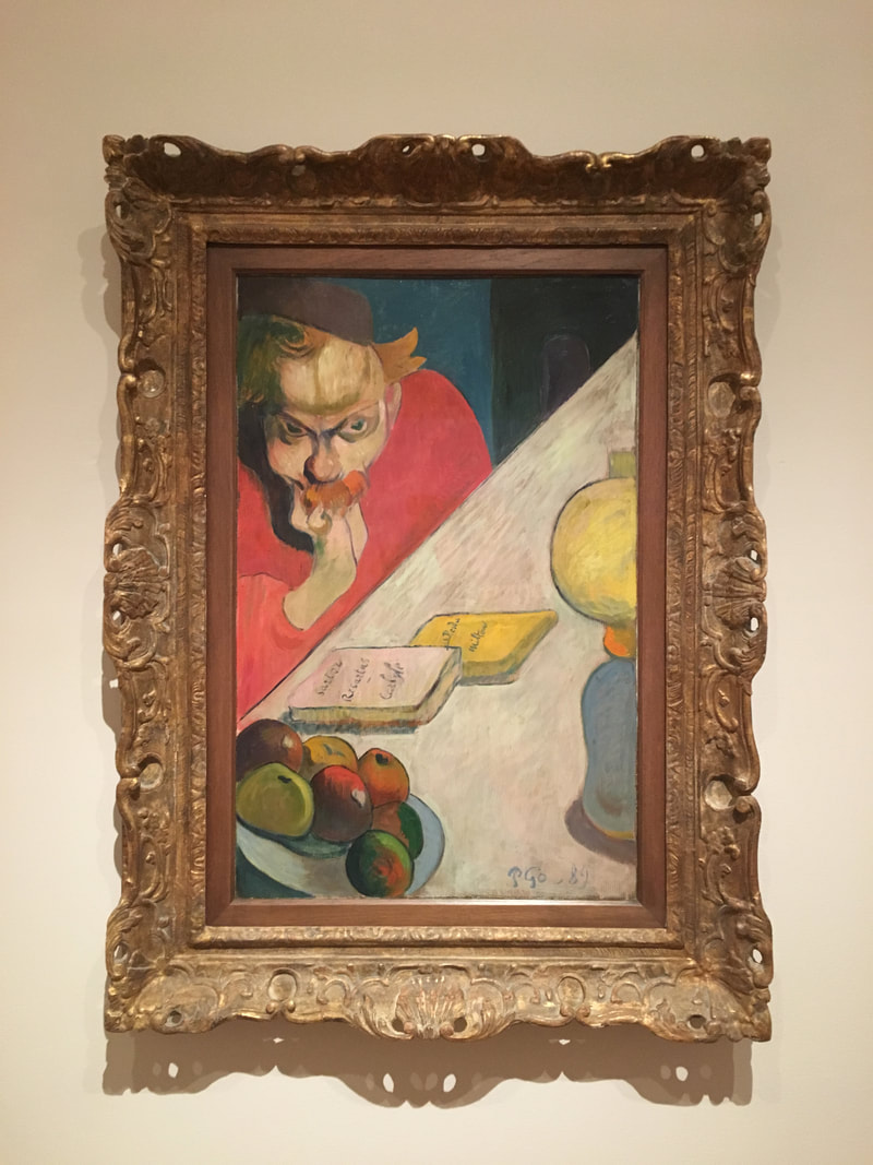
"Portrait of Jacob Meyer de Haan" - Paul Gaugin, 1889
Often exhibited alongside Vincent's (and Seurat's) paintings, the portrait of Gaugin's close friend in a pose of a thinker exhibiting preoccupations with religion and philosophy (demonstrated by books on the table): John Milton’s Paradise Lost and Thomas Carlyle’s Sartor Resartus. The lamp in the foreground is symbolising in an ancient Greek way the light that Diogenes would shine in the light of others "looking for an honest man". Maybe it is the colour chosen for the shirt of the main figure that stops us from diving deeper into the thoughts about morale behind our existence and the origin of species? Or maybe the painting was intended to be hung in a living room where a visitor, in a reclined chair opposite to the painting would have time to reflect on the idea expressed on this canvas? Or maybe it is just us in our busy world with only 140 characters brain RAM buffer? It is certainly one of the more "intended" paintings of Gaugin, thought-provoking and inviting to reflect on ideas beyond the colours of shirts and apples. Do we have enough time for it?
Let's see what thought-provoking Pablo has to add to this (in his Iberian period of warm colours). He is just next door.
Let's see what thought-provoking Pablo has to add to this (in his Iberian period of warm colours). He is just next door.
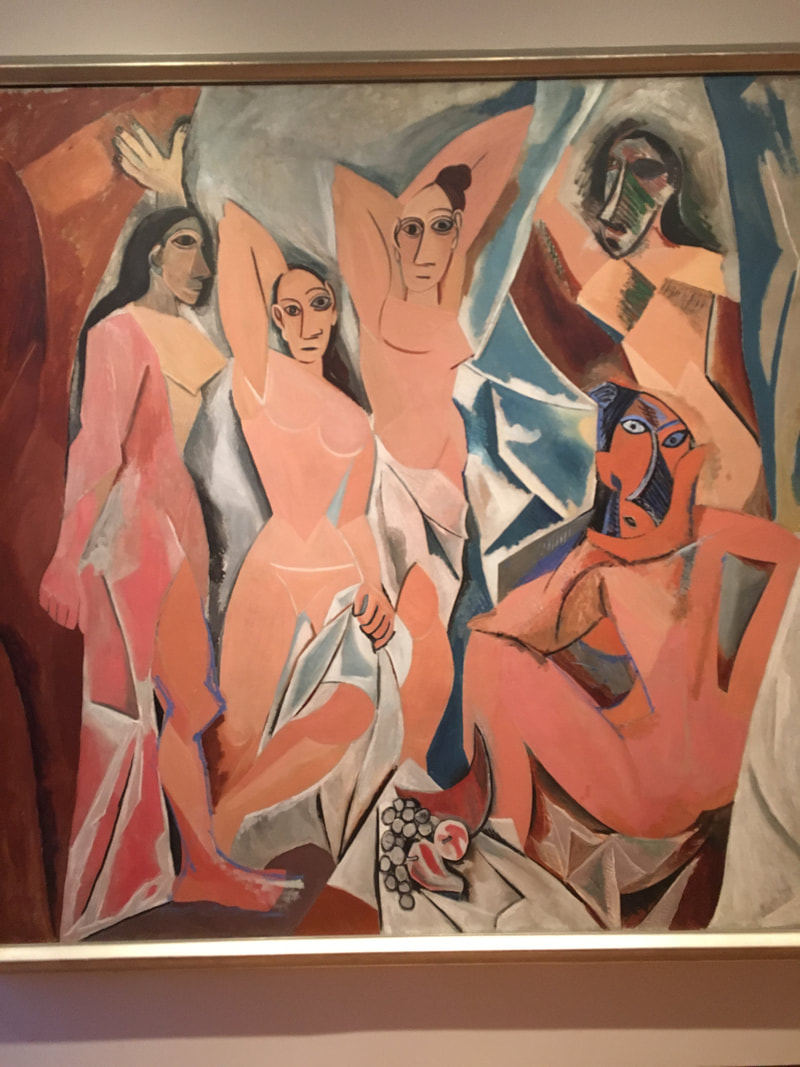
Les Demoiselles d'Avignon, Pablo Picasso 1889

From 7 figures (5 women and 2 men) to only 5 (all women), from an inward-oriented sketch to fully open, inviting, confronting 2.3x2.4 m canvas. From post-expressionism to cubism. These are the changes that Pablo made since the beginning of this work (early sketch on the left). Linked to the Avignon street (full of brothels) in Barcelona, five women appear to be prostitutes "looking at us as much as we are looking at them". This is shift that since Rembrandt artists are experimenting with,- viewer as an audience vs viewer as a part of an artwork (being looked at, confronted).
From the pulled up curtain, they pile out.. Provocative, yet speechless and emotionless, almost suggestive but senseless through the loss of geometric detail, the warm and crisp figures are making the painting inviting. The eye travels to trace the outlines, pick up the change in colour tones. More "cubic" women with half-circle mask-like faces on the far right serve as a reminder that Picasso is not entertaining us here with his new favourite Iberian rounded figures and peach colours. It is still the same subject, even if painted non-repulsively.
To me, when I see the "cubist" sigantures in Picasso's work it send the signal of distortion - distorted faces split into two, distorted lives, casted shadows. Similarly to his "Weeping Woman", I think the underliying theme here is that women do not end up with their faces split in two because of sheer happiness. What was it to Picasso? Was chopping the melon and the nose of the woman on the far right to look like sickles intentional? Are the women expressionless because they do not care anymore? The impossibly upturned table top is making figures and objects "fall out" of the painting, for us to deal with.
It definitely shows a change (even within one painting) of the artistic styles and expressions, but what is our take away?
In the early 20th century, with all the classical art and Renaissance weighting upon them, artists were forced to discover the new language of art, without mimicking nature or trying to be realistic, purely conveying the idea, the emotion.
Henri (Matisse) takes the figures out for a "Dance (I)
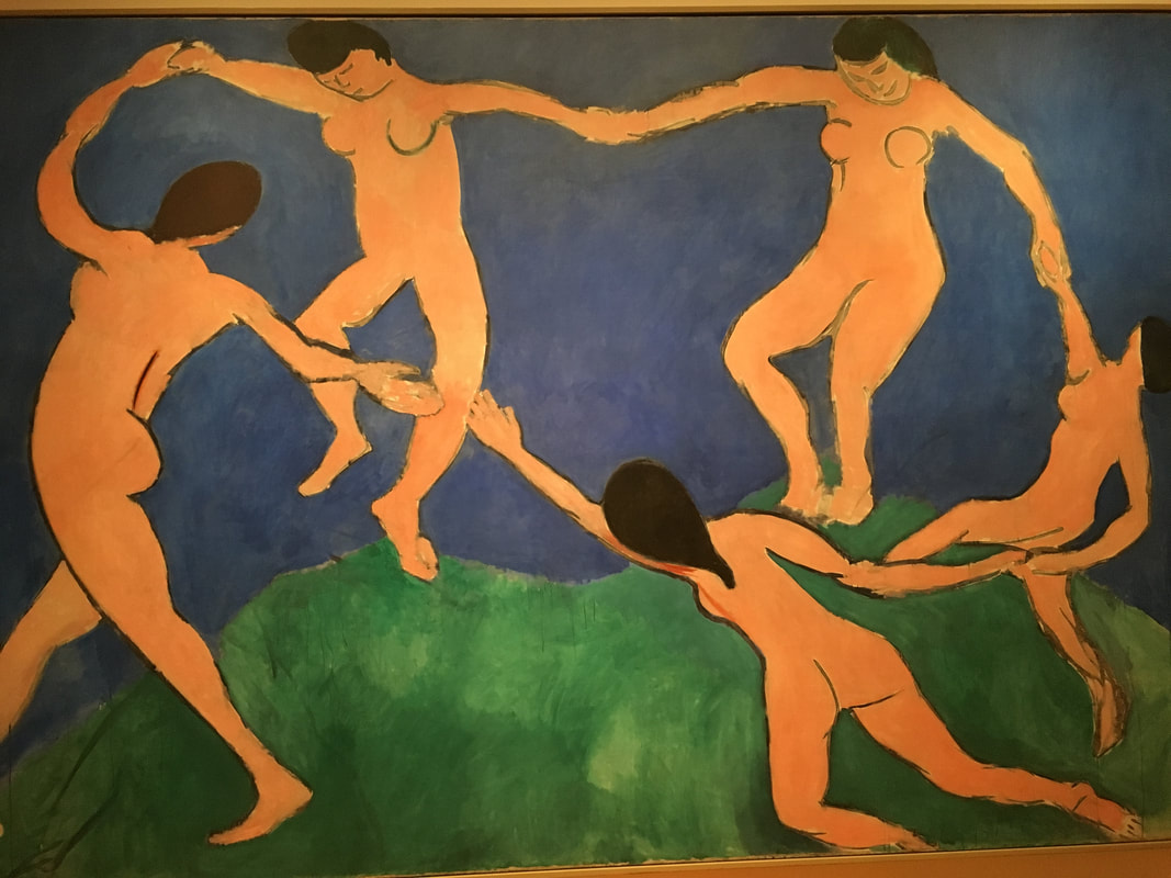
Dance (I) - Henri Matisse, Paris, early 1909
Seeking the union of colour and line to depict human body, Matisse had no success when the first revealed Dance (I).
His intent was to strip it down to few outilnes, abstract away the detail to reveal the "charm and grace", which looked somewhat unfinished and undone (look at the figure at the far left and its right hand). Intentionally, he has put the movement into the foreground, setting the whole scene in motion. With half of the figures floating in space, the painting is light and thus the figures take flight easily in our eyes. The painting was commissioned by a Russian collector alongside a companion piece "Music". The Dance (I) was intended to hang at the bottom of the staircase entered from the left, which explains the solid strong stance of the left-most figure, anchoring the painting, whilst the rest are afloat.
In comparison to dancing figures of Parisians against a detailed background, depicted in "Bal du moulin de la Galette" of his contemporary Renoir, Matisse's figures are pure flesh "set against fields of rich blue and green, is described in a single, arcing contour". Maybe this is the point? To use little detail, to not give the viewer a chance to get distracted, bogged down in examining the details, draw straight to the topic, allowing you to fill in the detail in between rich colours?
Mattisse's works show that he practiced the art of abstracting the details away for many years to get here..
And what about the detail? Are they something to hide? Or to put in the forefront? Monet is best to answer this.
Water Lilies - Claude Monet, Giverny, 1914-26
As appreciative of Van Gohg's work as I have been, as numb I have been to Monet's lilies. Up until this point.
There is something about the way the Monet's room is set up in MoMA that makes the light bring the water to life, makes the lilies float and stand out, composes blury brushstrokes into meaningful reflections of the clouds overhead and seaweed underneath. Lighting is so essential to Impressionists paintings. But not just the light. It is most likely the maturity of the viewer, the amount of knowledge acquired in years of learning about art, traveling around the world, seeing all the chef-d'oeuvres/masterpieces of modern art that makes the disjoint picture complete, as a puzzle taking shape, when the key pieces have been correctly inserted. What were these key piece?
In my opinion, it is the way we view the masterpieces, the way we encounter them, the way we make our opinions about them, digest and store them in our memories. Most if not all of us first see the paintings reproduced in print, web or other form, far sooner than in galleries (if ever). This is the first caveat, what is painted in oil, especially in pale or soft colours won't looks as appealing in print (with a few exceptions of late Van Gogh) as it would in real life. We make our judgement around paying or not paying attention based on how familiar with are with the subject in the first place. Another of "unconscious biases" if you will. Thus, we are predispositioned to "neglect" less know or less visually appealing/confronting paintings. Although,... this statement holds true for everything in life and the word "paintings" in the previous sentence can be replaced by any other noun of your choice. You can give it a go...
This is not the case with the lilies though, I have seen the lilies before and tried to "look into" this work but without much success. I think the other exhibit I have seen somehow failed to provide me with 1) the context and 2) the comparison.
The broader context is known of course: Giverny, a beautiful garden in the new house, lavished in Monet's care and assigned 6 gardeners. The pond. The lilies. Wait... Why they are so huge in the first place? Exotic lilies in the pond painted over 3 panels (not counting the Water lilies in Parisian Orangerie gallery) were intended to be interior "decorations" for which they are most certainly perfect. Do decorations have to stand out? make an appeal? attract attention? No, they are intended to just be, induce stillness, radiate warmth, calm and gentility. The contrast with another, more dynamic painting from the series , vertical canvas with vibrant Agapantus swayed in the breeze (also shown above) can be clearly seen. The torrent in the "Agapantus" picture and the wind, making the lily flowers lean to the side of the canvas is making the scene more dynamic, adds the motion, transporting us as if we were there, looking over the water, and this is what we would have seen. It is also very vibrant and depicted in colours that stand our more compared to the dreamy cloud reflections blurring the surface of the water in "Water Lilies".
Both of these works are fit for purpose. And it is important to consider their original purpose since the galleries take masterpieces out of their context, throw them into one room for our convenience and we take it for what it is, lacking the time to take a deeper look, reflect, take the art and its ideas in.
Not intending to write "How to visit MoMA and not miss out on understanding modern art". These are simply my reflections on how ideas in post-impressionism started us on our way of prioritising the substance over form, experimenting boldly with combinations of styles, intensity of expressions, setting up the scene for the pre-war expressionism and cubism.
These artists, well ahead of their time, owned their newly proclaimed views of the world, despite all odds and criticism, have given modern art and modern society the permission to continue on with its manifesto.
 RSS Feed
